Case study

✏️

Case study ✏️

Tapas - Beer Garden

By Noelia Martinez March - April 2022

My role: UX Designer - UX Researcher


Responsibilities:

My responsibilities on this project were to create user personas, user journey maps, conduct research, design wireframes, low fidelity prototypes, conduct usability studies, create high fidelity prototypes, mockups, and testing.

The goal:

Designing an ordering app for a beer garden that enables customers to order from their tables, eliminating the need to leave their kids or pets unattended. The app will have a user-friendly interface that is easy to navigate and will allow customers to browse menus, view prices, and place orders in a seamless and hassle-free manner. The app will also provide real-time updates on the status of orders and estimated delivery times. The design will aim to enhance the overall customer experience by minimizing wait times, improving order accuracy, and ensuring customer satisfaction.


The problem:

Users are at the beer garden with their pets or kids and don’t want to leave the table to order. Sometimes the line to order is too long. Currently, there is no app or website to order online.


Summary:

For my user research, I interviewed 4-6 people with different backgrounds and lifestyles.

 From the results, I've learned that some of the customers that visit this beer garden go with their dogs or with small children. To order an item they have to leave the table, which makes them feel uncomfortable leaving their kids or dog unattended.

Also, when the beer garden it's too full, there are long lines to order.

Before the research, I have never thought about this problem that affects customers with small children and pets. 

After the research, my goal is to create an app, that helps users to order easily from their tables without having to order from the counter.


User journey map:

The user wants to get to the beer garden and enjoy her time with her family. By having an app that makes it possible to order from her table, she can spend more time with her loved ones and don’t have to worry about leaving her kids unattended.


WIREFRAMING

Paper wireframes:

I draw six different versions of the home screen where users can see a list of favorite items from the menu, and add them easily to their table. Also, they can go to the full menu to select more products, access their profile section, and see social media links.


Digital wireframes:

Homepage

With the feedback collected from our first usability study, I designed the wireframe applying the Gestalt principles. I grouped some elements like “favorites” from the menu and social links in the footer.


Menu page

On this page, the user can easily access the full menu and add items to the table. This solves one of our user's pain points because they don't have to go to the counter to order and wait in long lines when the beer garden is too busy.


PROTOTYPING

Low-fidelity prototype:

The user opens the app, clicks on the menu button, and sees the full menu where they can select items and add them to the table. From there can click on the checkout button where the payment page opens. After submitting payment information, the user can review their order and receives an order confirmation. The user can then go back to the homepage or go to their profile to check the status of their order and rewards points.


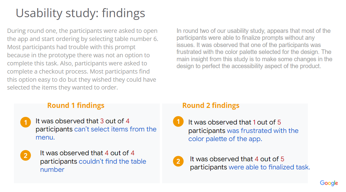
Usability study:


Mockups:

Before and after the usability study:

After the usability studies, I added an option to select the number of the table and a clickable button to opt for someone to bring the order to the table.


Before and after the usability study:

Before the usability study, the menu was a group, and participants couldn't select each item to add to their table. After the feedback, I redesigned the menu to show separate items that are clickable and easy to add to the order.


High-fidelity prototype:

The user opens the app, clicks on the menu button, and sees the full menu where they can select items and add them to the table. From there can click on the checkout button where the payment page opens. After submitting payment information, the user can review their order and receives an order confirmation. The user can then go back to the homepage or go to their profile to check the status of their order and rewards points.


Accessibility considerations:


TAKEAWAYS

Impact: 

Users adopted this app positively. The process of ordering from their table without leaving their kids or dogs unattended created favorable feedback. One of the users said, “ I love coming here because I can spend my time with my family and not wait in a long line to order food.” 

I feel confident about the usability of this product and the benefits to the customers.

What I learned:

One of the main insights from this case study was how important it is to study the usability of the product. The way we imagine the user flow is not always the way users follow in the real world, including people that interact differently due to disabilities. I learned the benefit of testing and getting feedback because in my initial prototype I didn’t include any accessibility features. In my high fidelity prototype, I was able to make these changes, adding accessibility features to create an easier user journey that benefits everyone.


Thank you for checking my case study

 
Previous
Previous

LAbouquet - Responsive website to order online