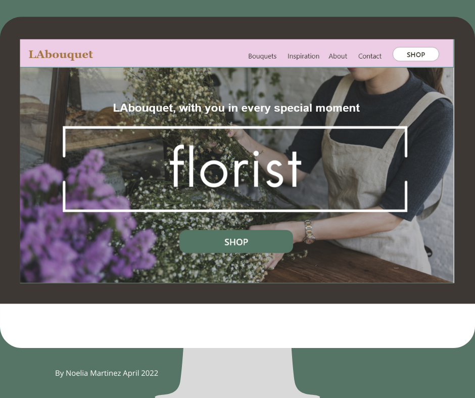
LAbouquet Flower shop
Responsive website - Case study
Role: UX designer - UX researcher
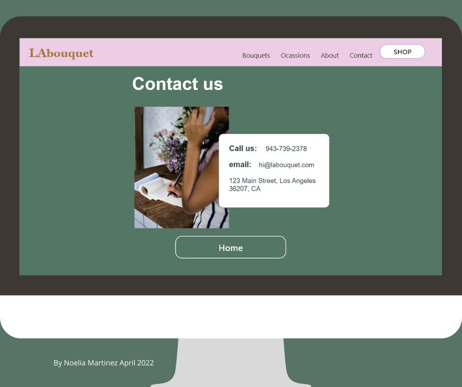
By Noelia Martinez April 2022

Overview
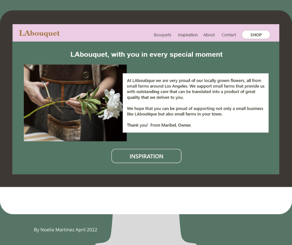
The local flower shop needed a UX design solution to enable their out-of-state clients to order flowers online. I created a responsive website that allowed users to easily browse the available options and place orders seamlessly. The website included features such as an intuitive user interface, a secure payment system, and customizable delivery date and time. The design also incorporated images of the shop's arrangements, as well as detailed product descriptions to help users make informed decisions. The result was a user-friendly design that increased online orders and improved the shop's revenue.
Methodology
For this research study I followed the steps in the Design Thinking process:
1. Empathize 2. Define 3. Ideate 4. Prototype 5. Test
Tools
Software I used for this case study and prototypes:
1. Adobe XD 2. Figma
3. Canva 4. Zoom
User personas
For my user analysis, I use a combination of online research about consumers that send flowers online and interviewed five friends and family members. From the results, I created two user personas: One is local and loves buying flowers for his business. The other lives in Miami and wants to send flowers to her friend in San Diego for special occasions.

User journey
Olivia wants to send flowers to her friend who lives in San Diego, CA from her hometown in Miami. She searches on Google for local shops in San Diego, and to her surprise, there are very few local flower shops with responsive and well-designed websites. Finally, she decides on a bouquet she likes, adds it to the cart, and follows through with the checkout process, but she can’t finish it because the website is asking to add an address in California to proceed with the order.

Empathy map

Wireframes
Paper wireframes
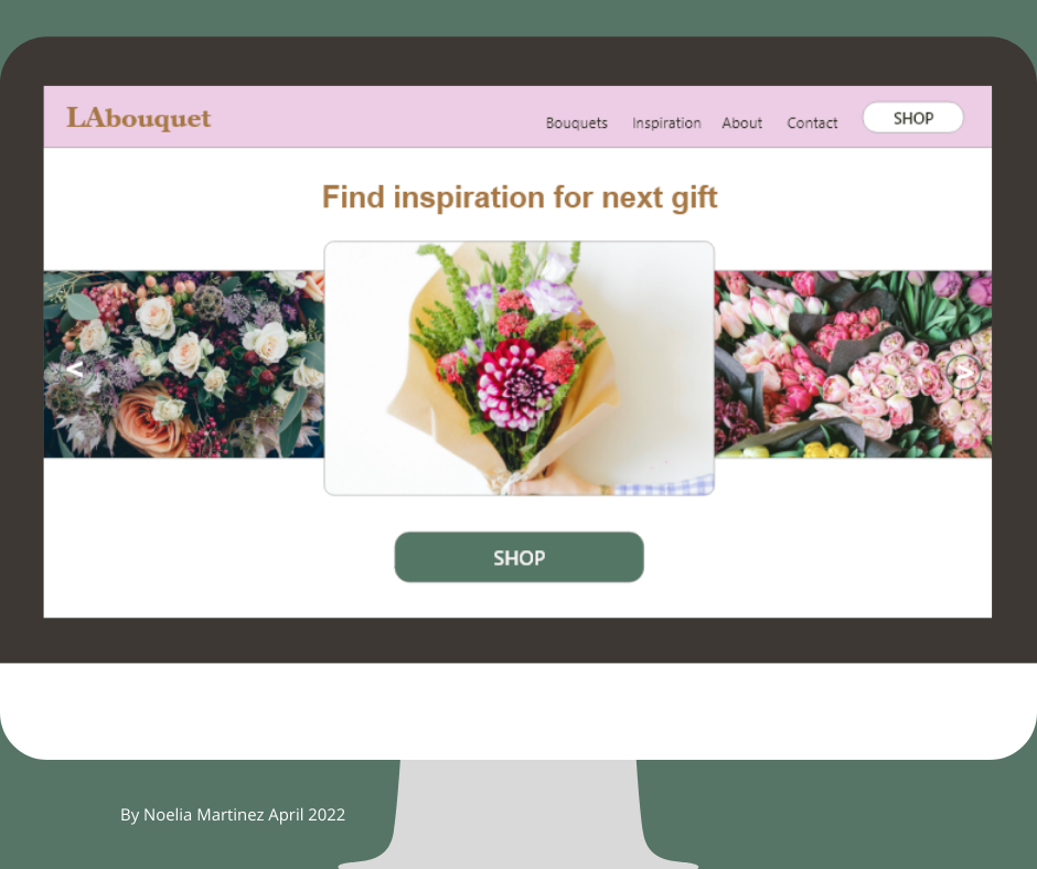
I draw four different versions of the home screen where users can see a list of most popular bouquets from the shop, and add them easily to their cart. Also, they have access to a photo gallery to get some inspiration in bouquet trends.
I draw the wireframes on paper and then digitalized them on my Ipad using the Procreate app.

Digital wireframes
With the feedback collected from the first usability study, I designed the wireframe on Adobe XD, applying the Gestalt principles. I grouped some elements like “most popular bouquets”. Using the proximity Gestalt principle I placed the social media icons close together.

Prototype
After defining the elements I wanted to use from my paper wireframes and the user research, I picked the color palette based on color trends for the Spring-Summer '22 season.
I created the low fidelity prototype, an early model of the product that demonstrates the functionality using Adobe XD.
Low-Fi prototype
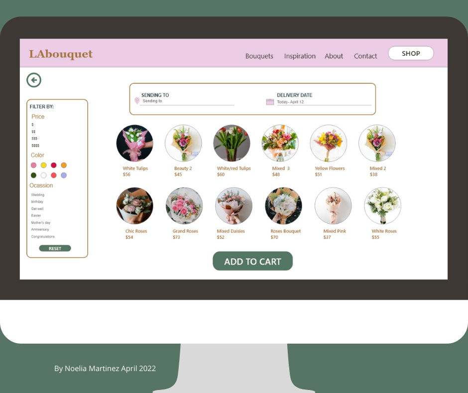
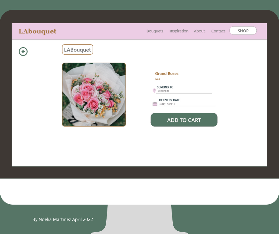
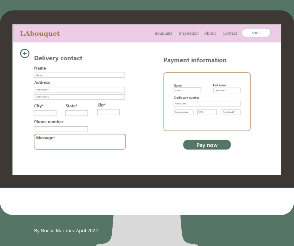
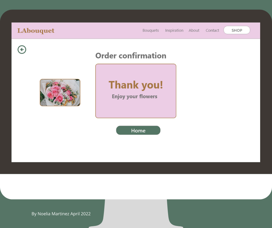
The customer opens the website and finds a hero image with a button to be directed to the shop. Once there, the user has a variety of bouquet images to select and a sidebar with filters to narrow their search by price, color, and occasion. After selecting their favorite bouquet they are guided throughout the checkout process.
Low fidelity prototype on Adobe XD

Low fidelity prototype with interactions on Adobe XD

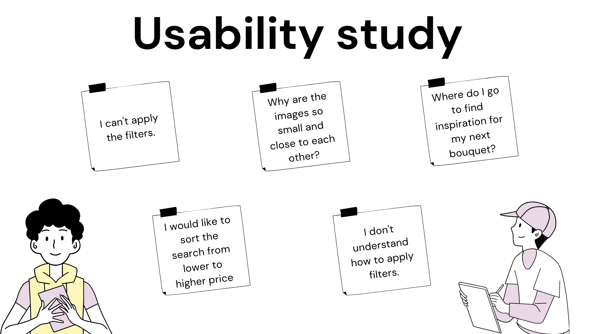
Usability study
For the usability study, I interviewed five participants, friends, and family members that tested the website with the prompts given before starting. I asked them to complete tasks such as - Applying some filters to their search from the filters sidebar or - Adding a bouquet to their cart and completing the checkout process. The insights helped me recognize themes and make changes to the design.
Learning from mistakes.
During my first usability study, it was observed that two out of five participants didn’t know where to find the inspiration page and three out of five couldn’t apply filters to narrow the search.
This indicates that some things weren't easy to find, for my next prototype, I should label the page with a different name and I'll have to re-design the filters side menu for easier functionality.

Second usability study
In round two of our usability study, appears that most of the participants were able to finalize prompts without any issues. It was observed that one of the participants was frustrated with the way images were aligned, this issue was fixed after the feedback was received and now images are being displayed in a carousel mode. The main insight from this study is to make changes in the design to offer better accessibility.
High-Fi prototype
Based on the insights compiled from the usability studies, I changed the color palette and added shadows and depth to the buttons to make them easy to recognize. Also, I added images, and text that reflects a closer look and feel of the final product.
High fidelity prototype designed on Adobe XD

High fidelity prototype with interactions designed on Adobe XD

Mockups
Before the usability study, the filters menu was not clickable, and participants couldn't select each item to apply filters to their search. After the feedback, I redesigned the menu to create clickable buttons giving the user a better way to narrow the search.
After the usability studies, I renamed the page to inspiration instead of occasions. Now the images are arranged in carousel mode.


Website pages mockup -Desktop
Takeaways
Impact:
Customers are using the new website with positive feedback. Sending flowers from their hometown to someone special in California created some loyal customers with a return rate of 60%.
One of the customers said, "I love ordering flowers from LAbouquet because their ordering process is easy, and at the same time, I can support small farms."
I feel confident about the usability of this product and its benefits to its customers.
What I learned:
One of the main insights from this case study was how important it is to research the user's journey and test the usability of a product.
I learned the benefit of testing, getting feedback, and redesigning to make changes to the initial prototype.
The way we imagine the user's flow is not always the way users follow in the real world, including people that interact differently due to disabilities.
Moving forward:
For the next steps, I would like to have live data to know how many customers are ordering from out of state versus from California. Also would like to gather more information about issues that users might encounter with the final product.
And I'll add more accessibility features.
