The empathy factory
Dedicated app and complimentary website - Case study
Role: UX designer leading the app and responsive website design from conception to delivery. UX researcher conducting interviews and brainstorming sessions with parents, educators and kids
By Noelia Martinez April 2022
Overview
This UX design case study focuses on creating an app and website in Spanish and English to teach kids about empathy. The design incorporates colorful and engaging graphics to make learning fun and interactive. The app and website utilize a combination of educational games and exercises to help kids understand empathy and its importance in building strong and healthy relationships.
Problem:
Kids have big feelings and emotions, they are learning how to manage them every day with interactions in school and at home. Teachers and parents need a way to teach kids about empathy and emotions that is easy to understand and fun to learn.
The goal:
Design an app to help kids learn empathy and emotions. It should be easy to use with visual cues and activities. Encourage kids to consider how their actions affect others and provide positive reinforcement for understanding and managing their emotions.
Methodology
For this research study, I followed the steps in the Design Thinking process:
1. Empathize 2. Define 3. Ideate 4. Prototype 5. Test
Tools
Software I used for this case study and prototypes:
1. Adobe XD 2. Figma
3. Canva 4. Zoom
User research
After interviewing parents and educators, and conducting small group research on four kids, I learned about their interest in learning about empathy and their creative approaches to it. My research yielded insights into making the teaching of empathy and emotional intelligence fun and engaging.
User personas
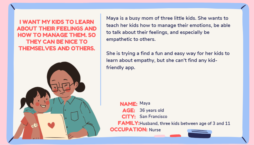
I created two user personas from the study:
Maya is a mother of three young children who is passionate about teaching her kids about empathy and how to be kind to others.
Mathew is a 6-year-old boy who loves to read and play outdoors. He sometimes struggles to handle his larger emotions, so his mom is eager for him to learn strategies to help him cope.
With these personas in mind, I designed a product that will meet the needs of parents and children alike.

Competitive audit
After researching a few comparable products and websites that provide resources for teaching kids about empathy, I was able to identify opportunities for improvement in the market. For instance, there is a need for more apps that can help kids understand their emotions and the emotions of others. With this information, I believe that companies can create products that can fill the gaps in the market and help to educate children in a fun and engaging way.

Ideation
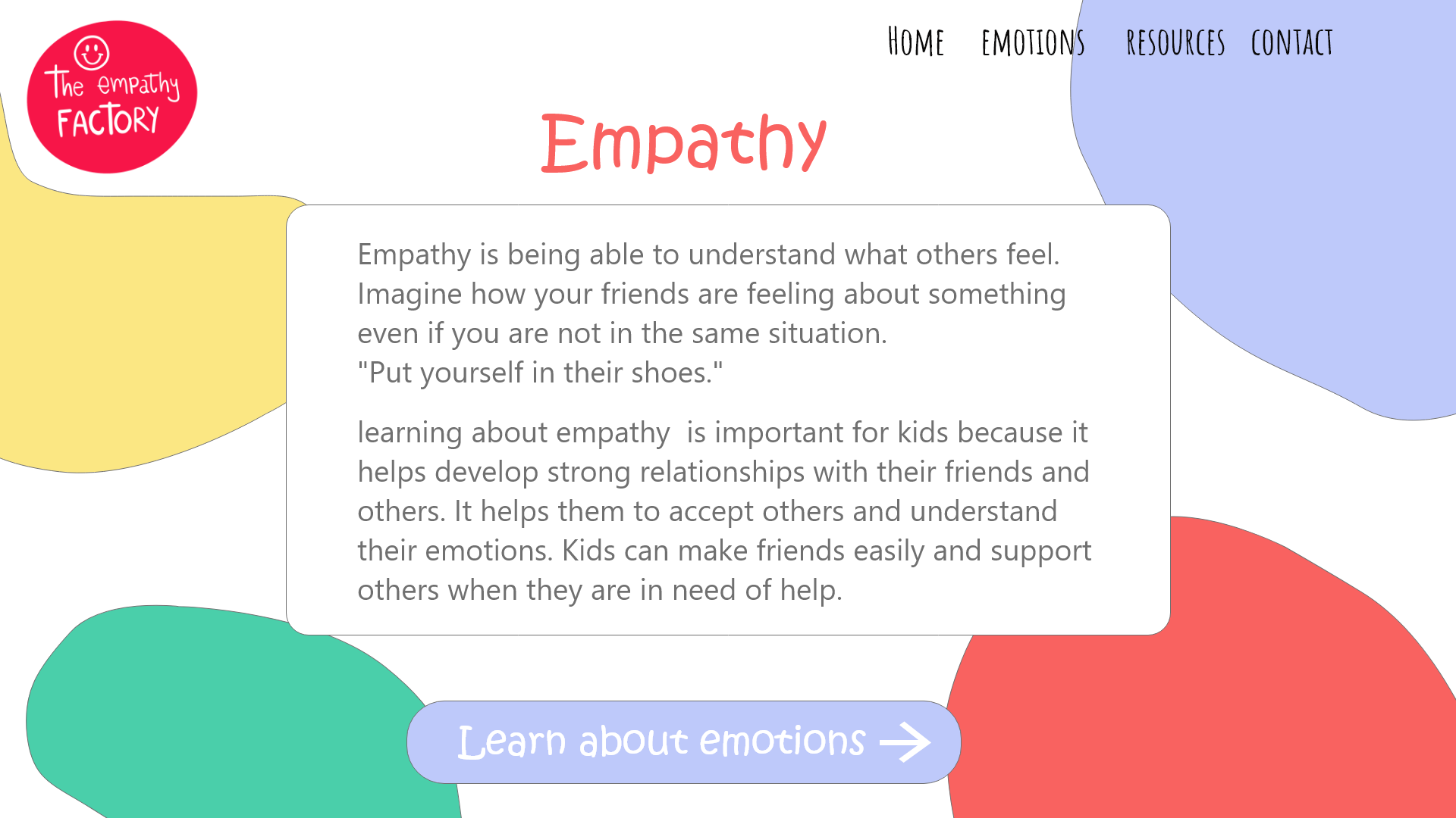
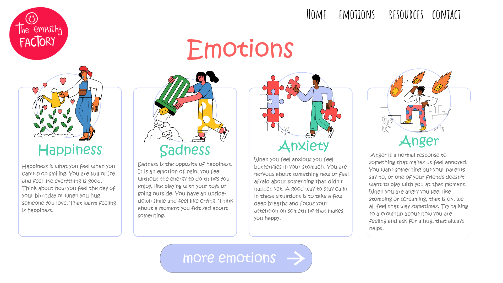
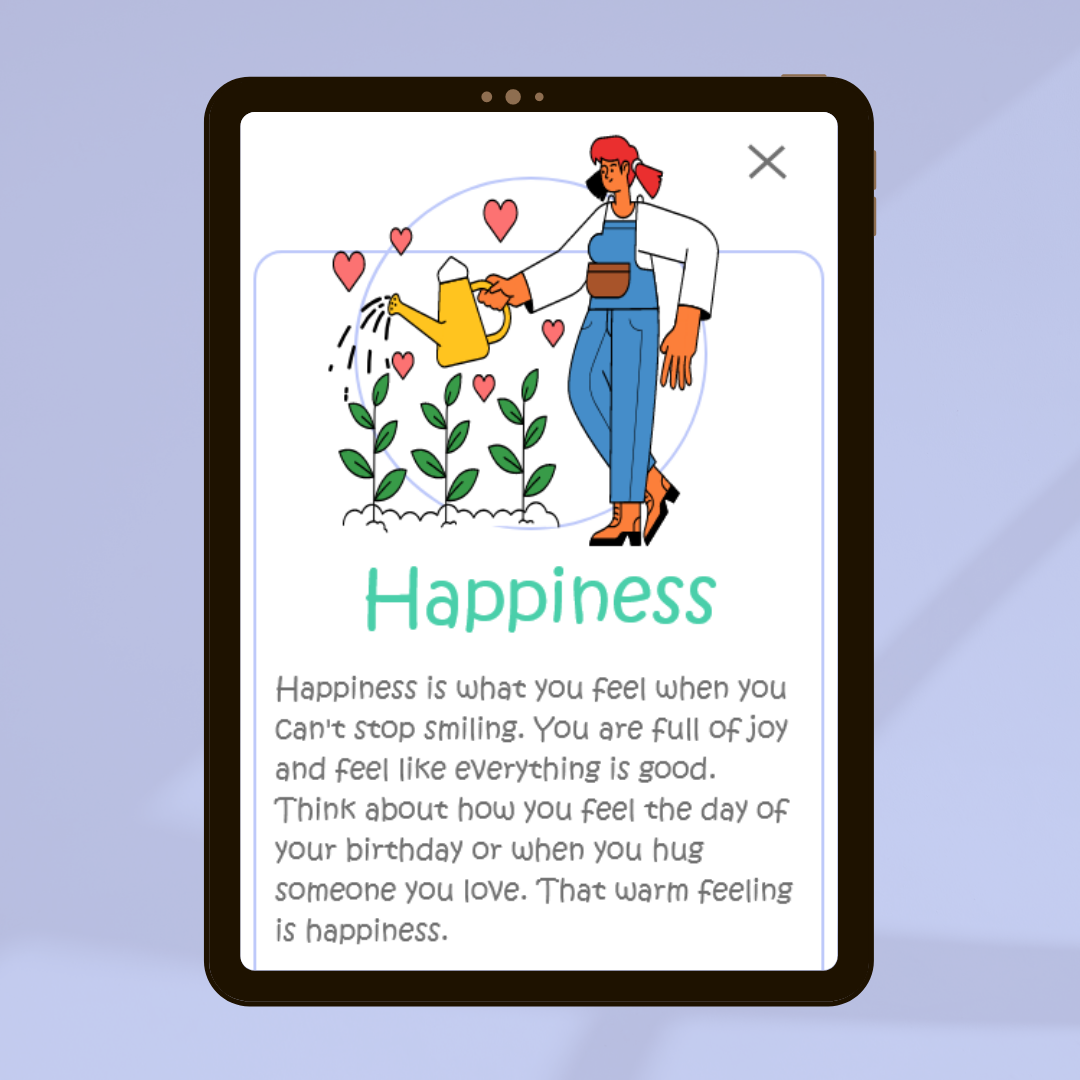
I brainstormed some ideas for how to incorporate content into a user-friendly, age-appropriate format. My main focus was to create illustrated cards that explain the meaning of various emotions in a way that children can easily understand.
Wireframes
Paper Wireframes
I sketched five different wireframe layouts for the home screen to brainstorm creative and engaging ways to display the cards. This allowed me to explore various configurations and discover the most effective and enjoyable approach for the user experience.

Digital wireframes
I explored different ideas and sketched out some wireframes on paper. Based on this, I created the initial designs for the empathy app. This design featured illustrated cards with descriptions of various emotions and showcased the initial user journey to better understand how users will interact with the app.

Prototypes
After conceptualizing the elements that I wanted to include from my paper wireframes and the user research, I chose a color palette that would best suit the needs of my product and was in line with current trends. To bring my vision to life, I used Adobe XD to create a low-fidelity prototype; this allowed me to visualize my product and make any necessary changes before creating the final version.
Low fidelity prototype
In order to ensure a successful usability test, I crafted a low-fidelity prototype that connected the user journey of a child accessing the main screen of the app, as well as navigating through the various emotion cards. Additionally, I created a flow for parents to access supplementary resources.
Low fidelity prototype with interactions in Adobe XD

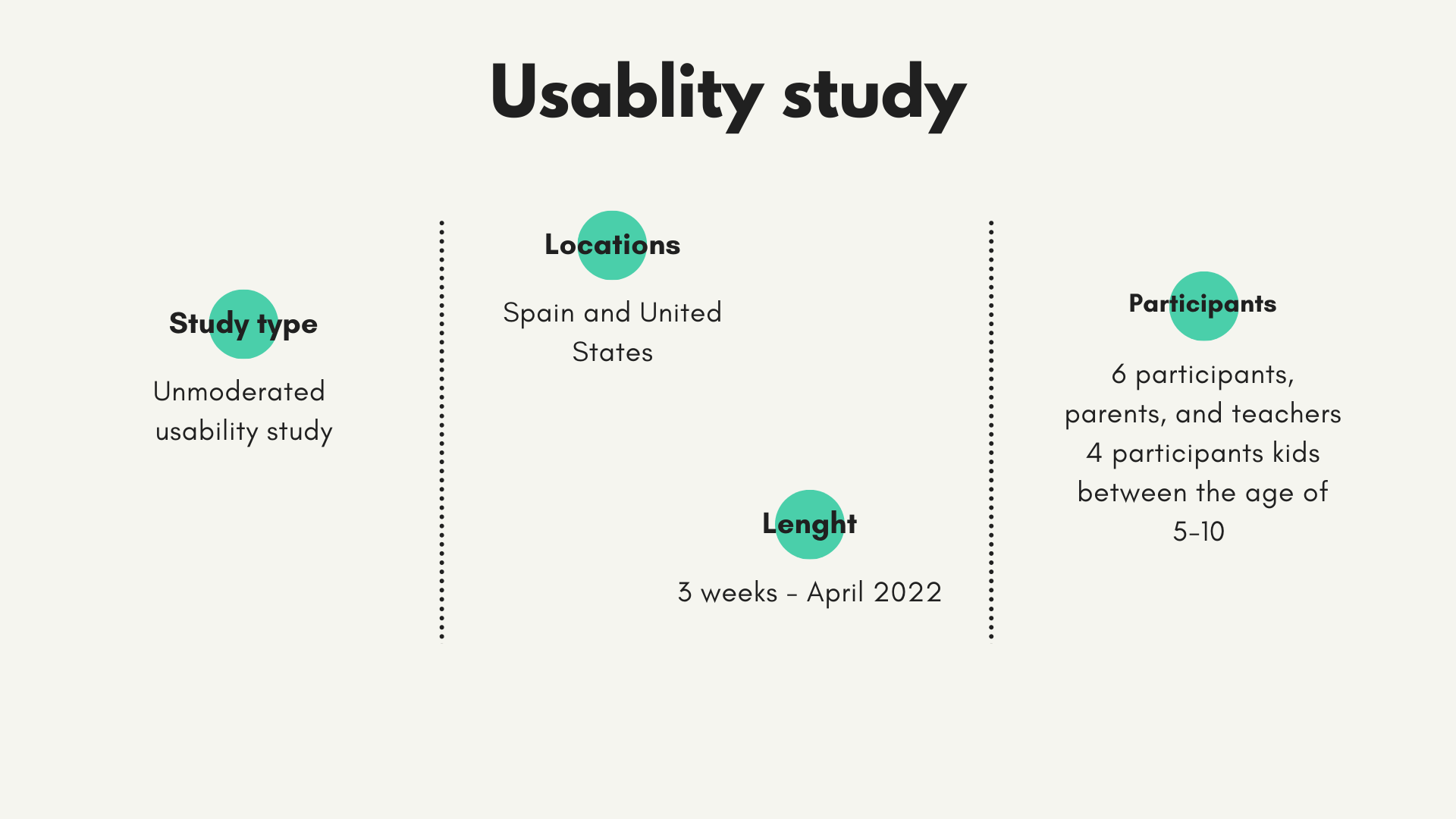
Usability study
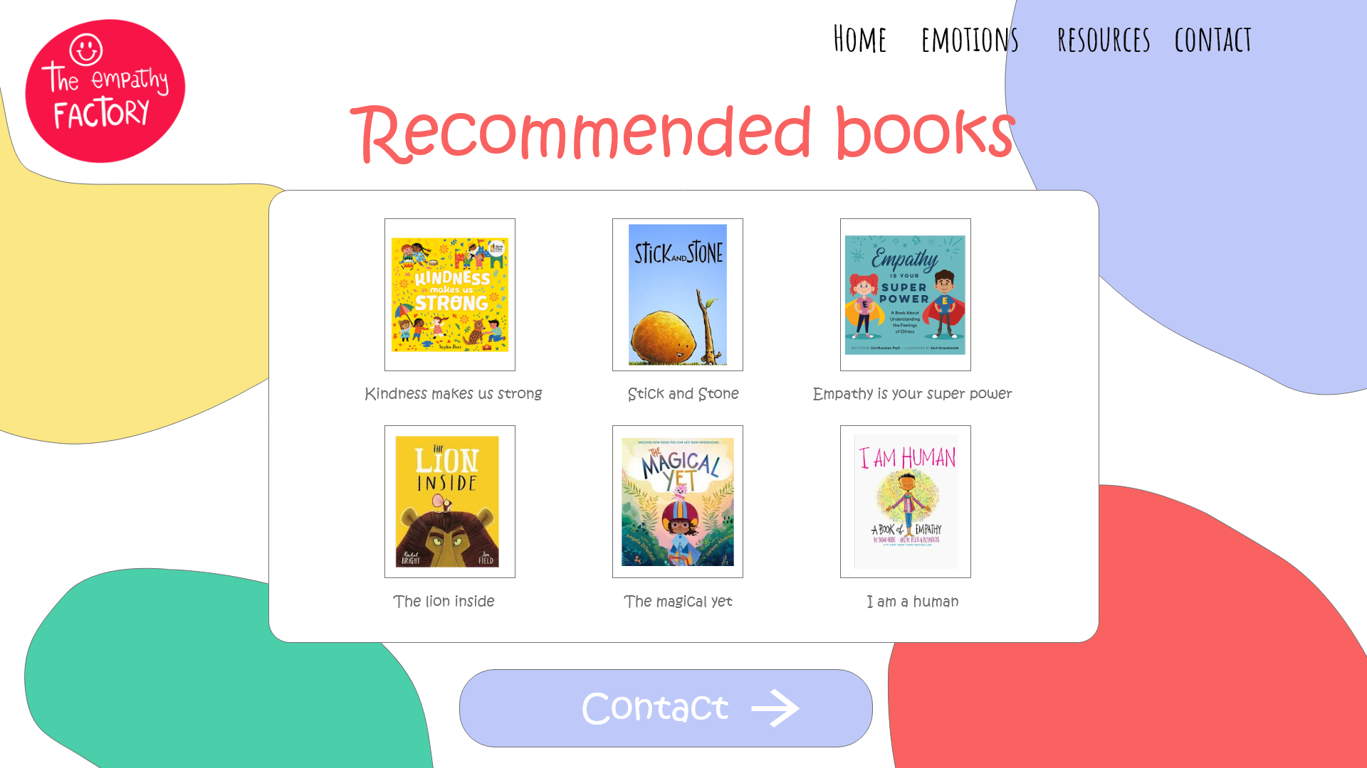
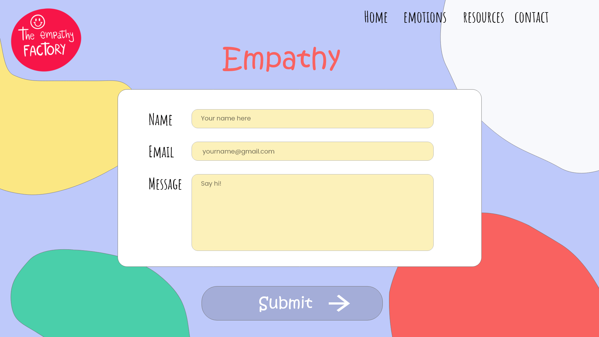
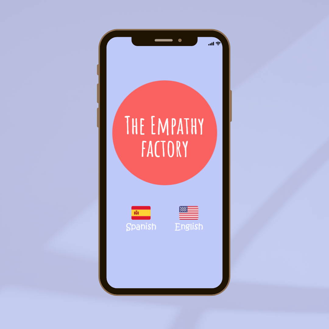
For the usability study, I asked five friends and family members to put the website to the test! I gave them some prompts to start, and then asked them to complete tasks like selecting their favorite emotion icon and reading the definition, exploring recommended books, and switching the language from English to Spanish (or vice-versa). Their feedback enabled me to recognize some key themes and make necessary changes to the design.
Learning from mistakes.
It's essential to learn from mistakes and work towards improvements. During the usability study, some participants had difficulty closing tabs or returning to the homepage. To improve the user experience, it's recommended to provide more information on the next steps and add sounds to the interactions. Although sounds aren't necessary for the app's functionality, they add a level of engagement and interactivity that can benefit the user.


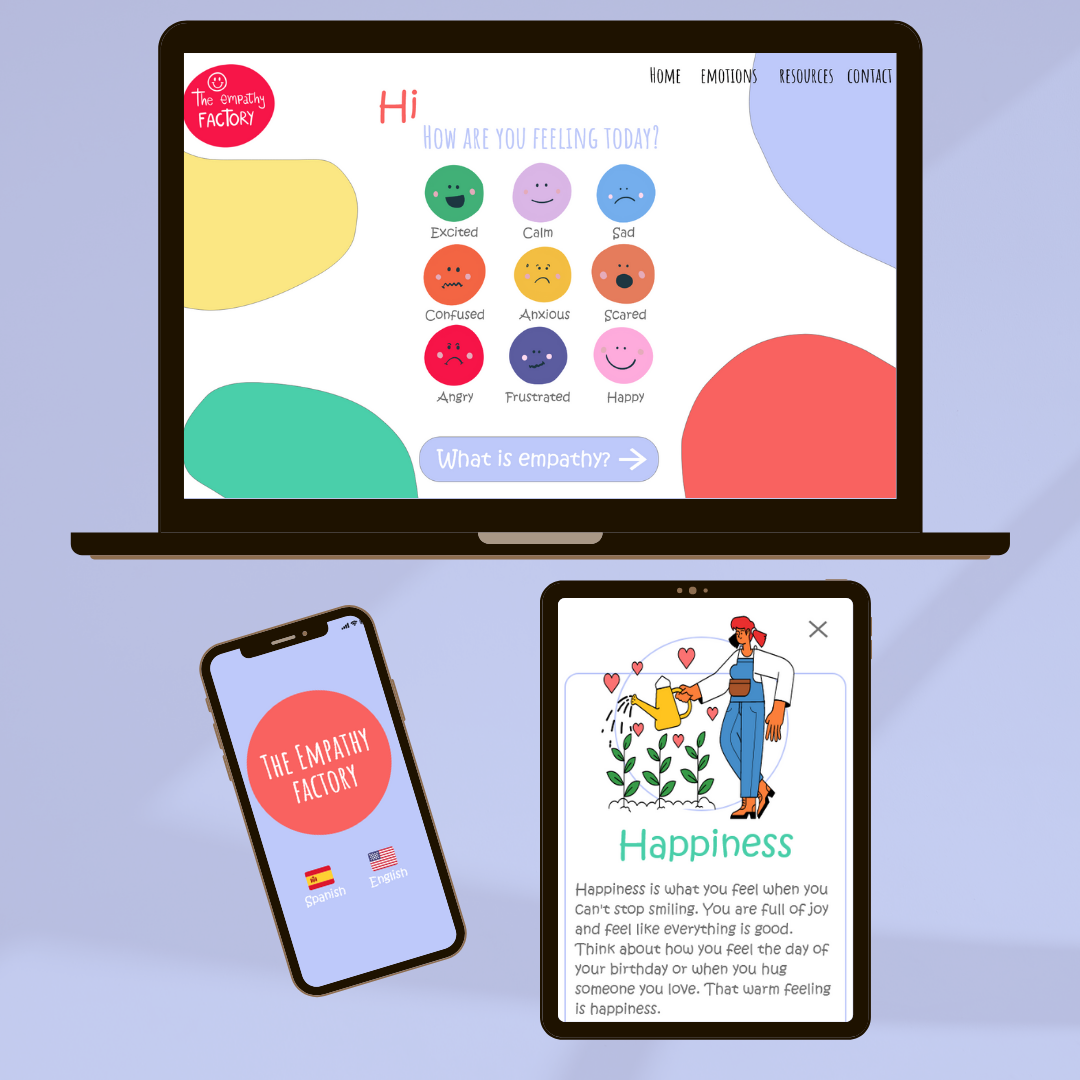
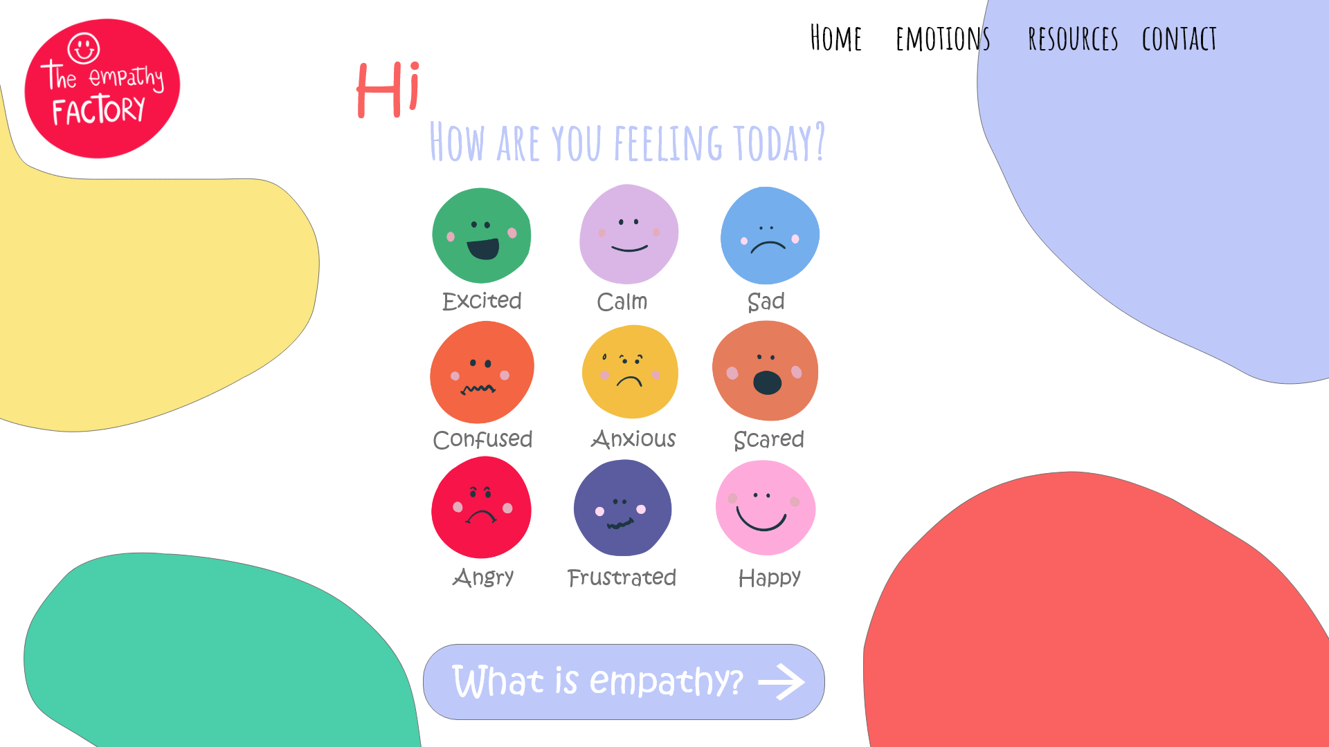
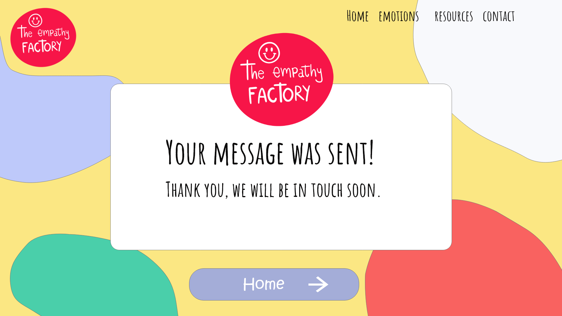
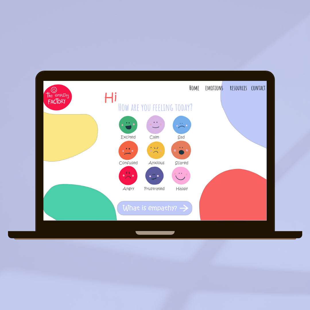
High fidelity prototype
The high-fidelity prototype followed a similar user flow as the low-fidelity prototype, including design changes made after the usability study.
High fidelity prototype app designed in Adobe XD

High fidelity prototype website in Adobe XD
Sitemap
With the app designs completed, I started work on designing the responsive website. To ensure I organized the content in an efficient and effective manner, I created a sitemap. This enabled me to visualize the different web pages and how they would fit together to create a clear, structured user journey.

Responsive design
I created designs that could easily adjust to the size of the device or screen being used such as mobile phones, tablets, and laptops. This was done to ensure that the user experience was optimized for each device.
Mockups
app pages mockup - Mobile

Website pages mockup -Desktop

Takeaways
Impact:
The UX design of the empathy app has had a positive effect, making learning and sharing about emotions enjoyable and stimulating. Its card definitions are simple and understandable for all users, even children. Feedback from one user showed that the app's techniques were very useful in managing emotions.
What I learned:
As a parent and educator teaching children about their emotions and helping them express their feelings is a crucial part of their development. When designing with children in mind, the challenge of creating simple yet effective solutions is a highly rewarding process. It requires a thorough understanding of the user’s needs and a creative approach to the design process.

